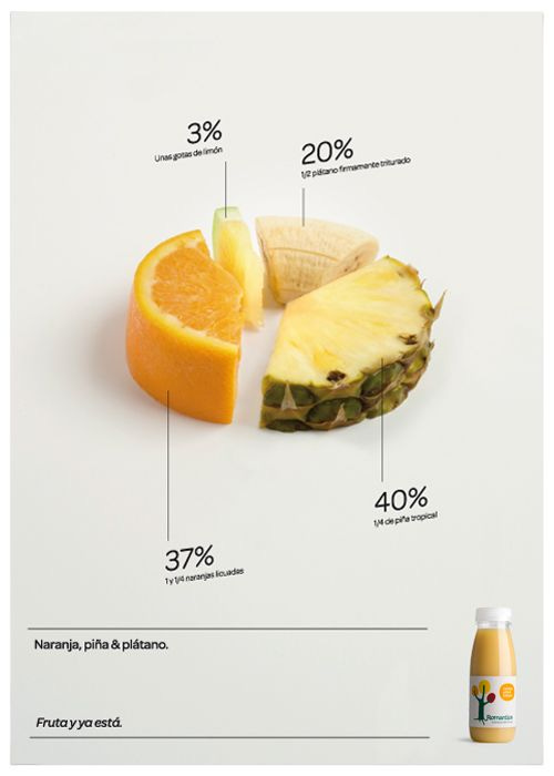
📈 The Power of Data Visualization
Unlocking Insights through Visual Storytelling
Data is the lifeblood of any modern business, but raw numbers and statistics can be overwhelming and difficult to understand. That's where data visualization comes in. By presenting data in a visual format, we can turn complex information into easily digestible insights that anyone can understand. In this playbook, we'll explore the benefits of data visualization and provide tips for creating effective visualizations that communicate your message clearly and efficiently.
💡 Benefits of Data Visualization
Spotting the Unseen: Data visualization brings hidden insights to light, helping you discover patterns and trends that may have otherwise gone unnoticed.
Simplifying Complexity: Complex information can be simplified and presented in a visually intuitive way, making it easier for stakeholders to grasp and interpret.
Effective Communication: Visualizations enable clear and concise communication of insights, allowing you to convey your message with impact.
🔑 Tips for Effective Data Visualization
1️⃣ Craft a Clear Message: Start with a clear understanding of what you want your visualization to communicate. Ensure your message is compelling and easily comprehensible.
2️⃣ Choose the Right Visualization: Different datasets call for different visualization types. Select the one that best suits your data and effectively conveys your message.
3️⃣ Embrace Simplicity: Avoid clutter and unnecessary details that may distract from your message. Keep your visualizations clean, concise, and impactful.
4️⃣ Strategic Use of Color: Leverage color strategically to highlight important information, but exercise restraint to prevent overwhelming your audience.
5️⃣ Iterate and Improve: Seek feedback from others and be open to making iterative improvements to enhance the effectiveness of your visualizations.
✅ Understanding the Data: Effective data visualization begins with a deep understanding of your data. Identify relevant data sources, clean and structure the data, and ensure accuracy, completeness, and consistency for reliable insights.
✅ Choosing the Right Tools: Explore various data visualization and analytics tools, such as Tableau, Power BI, Google Data Studio, and Excel. Evaluate their strengths and weaknesses to select the best fit for your specific needs.
✅ Creating Compelling Visualizations: Once armed with data and the right tools, it's time to bring your visualizations to life. Choose appropriate charts and graphs, design clear and visually appealing visualizations, and remember to declutter for enhanced impact.
✅ Conducting Thorough Analysis: Dive into your visualizations to uncover patterns, trends, and relationships. Use statistical methods to test hypotheses and make predictions. Ensure rigorous analysis and communicate results accurately.
✅ Effective Communication of Results: Finally, present your analysis in a clear and concise manner. Utilize visualizations and other tools to emphasize key insights, and tailor your presentation to suit your audience. Provide context to help stakeholders understand the implications for decision-making.
🛠️ Tools for Data Visualization:
Tableau: An industry-leading data visualization tool offering powerful features and interactive visualizations.
Power BI: Microsoft's business analytics platform that enables data exploration and collaboration.
Google Data Studio: Google's free and user-friendly tool for creating customizable, shareable dashboards and reports.
Excel: The versatile spreadsheet software that also offers basic data visualization capabilities.
In today's data-driven world, the power of data visualization cannot be overstated. It has the ability to transform complex data into captivating stories that drive informed decision-making. By following the tips and leveraging the right tools shared in this playbook, you can unlock the full potential of data visualization, creating visuals that not only communicate insights but also ignite meaningful conversations.

